My Blog
Tache, Color, and Darkness November 3, 2024 15:49 2 Comments

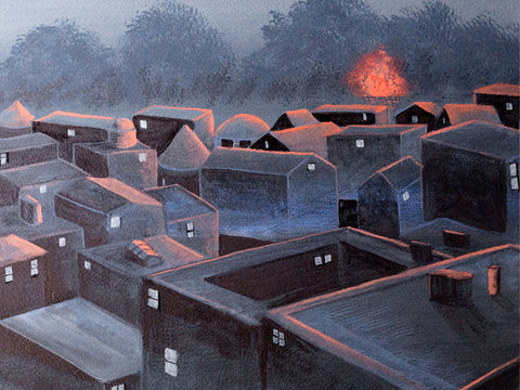
I've been working on this traditional landscape, still in progress. I started out using a very watercolor type painting style, brushing across the support, not really being that opaque, and I was mixing watercolor paints like WN French Ultramarine with WN Permanent Yellow Deep Gouache. It didn't work. I had to redo it. I'm having to retrain myself to not use watercolor painting techniques with gouache.
I admire the flat, “poster” style of some gouache painting, but I don't want to do it myself. I want a little texture. At the same time, I don't really want to learn how to paint using gouache with a palette knife or even very thick paint that shows the brush bristles. I had thought that I did having seen R.K. Blades's gouache paintings where he uses texture and (I think) a palette knife or at least a boar bristle brush. But I want the paint to be more manipulable than that.
I decided to redo the background I had of this work, keeping in mind using gouache's qualities. Since it's not oil, I can't just paint over it like it's dry oil paint. I have to approach it with a soft touch if I'm covering a lot. One way to do that is to use tache. I'm not using it much like 19th-century artists did, for “optical mixing”--putting different colors close to each other counting on the human eye to mix them. I have never thought that kind of mixing actually works. The dots of different paint always stand out to me. But tapping the brush on the support can give a really nice variety of color due to the different thicknesses of paint, even if it's opaque. I think you can see that here, especially in the upper 2/3s of the painting.

I knew I could use a deerfoot brush to do that—I have regularly used my deerfoot brush to make leafy trees in watercolor (the deerfoot is the lower of these two; the other one is a blender). And then I can go ahead and scrub over them without having to worry about wrecking the lower level of paint. That's what I did with this. And I think that is working.
The other oil technique I can use with gouache is glazing/scumbling. I already knew that from other water-media paintings I've done where I've used scumbling, like drybrush watercolor. You use a dry brush and paint that's pretty thick on the tips of the brush hairs, paint that's a little thicker than heavy cream, and scrub. Then you can get a nice scumble layer, and it looks really good. It's kind of almost a hammered look, or like those small clouds one sometimes sees high in the sky, little cushions of cirrus clouds.
I do feel like I have a lot to learn about using gouache the way I want to instead of just trying to make it do what watercolor does. It can't do that. Or if I try to make it do that, it won't look as good as it would if it was watercolor. That would be just ignoring the inherent property of gouache—its opacity.
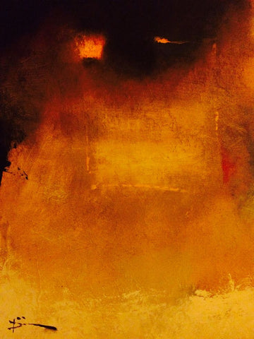
And I also want to work harder on having intense colors as opposed to the kind of gloomy colors I've been using. I like gloomy, but I think my paintings are not gloomy enough. They are too half-assed in terms of color. The one painting I did of the city with the sun coming up,
that was gloomy enough, but it could still be more gloomy than that. But with a lot of others, it's more like the colors are kind of tepid. They're not gloomy enough. So my paintings either need to be much darker, like the guy who painted those tree paintings where you just barely see the trees, it's night, or figures are just silhouettes.
The other side of that is using more intense color. I use lamps that are pretty bright so that I can see when painting small details. But that means the paint looks much brighter than it is in normal room light. And I end up with paintings that are limp in terms of color. I want to ramp up my color, make it richer and brighter.
So a couple of things I need to work on are continuing to explore tache as a painting technique and experimenting with more intense colors or much, much darker ones.
The Point of It All October 5, 2024 14:31
 This is a work in progress that I was getting ready to abandon a week ago. This idea of abandoning--not just a particular painting, but my art altogether--has been knocking around in my head for a few months. I know it's partly because of the demands of painting in a completely new style, relying on the Surrealist method of automatism. This has resulted in some really good paintings for me, but it is also not easy, and like anything new an artist (or anyone) might try, it's scary. With each new painting I'd become convinced that I would have no ideas in my subconscious to pull up onto my support. I feared it would either be an empty sheet, or worse, trite. For most artists, trite = death.
Dealing with the problem of smudging by changing mediums August 10, 2024 10:54
I was having a hell of a time trying to figure out how to fix my colored pencil work on watercolor. I couldn't stand the toxic stench of the sprays and don't have a garage or whatever to do it in. I tried some other ways of fixing but ended up negatively affecting the watercolor layer.

So I decided that I had to try using paint. I started with the house on the left side with the highly slanted roof. I'd already done the entire house in colored pencil but began going over it with gouache. Since I started with the roof, which was already about lines, I used a small round and mixed up my gouache with a bit of zinc and a small amount of water to end up with a creamy paint that would tend to skip over the paper's texture. I think used a couple different values ang one other color to create the shading, mostly by doing lines, almost like in engraving. I also used drybrush scumbling to create shadows. You can see this in more detail on the product page (click on the image there to get a lot of detail).
This has worked pretty well for me. I do miss the scumbling granularity I can get with colored pencil, but using the paint in a scratchier way does give me some of that.
Fixatives July 17, 2024 12:33 2 Comments

I ran into a problem with this painting--and all the paintings I've been making with watercolor and colored pencil. It's a technical issue that has to do with the finish. I had bought a fixative a while ago that can be used with colored pencil or pastels--Lascaux. (Well gee, the manufacturer's site says it's not smudge-proof. Nice not to put that out there in general) Expensive, but it had really good reviews. So what the heck, I decided to try it on a small painting the other day.
I found out it doesn't work. No amount of spraying will keep the stuff from smudging. I was hesitant about it anyhow, because it smells like death and has a cancer warning on it, just like almost all the spray fixatives or varnishes do. I try to be low toxicity with my art, plus it's a real disadvantage to have to use it outside in winter or when it's windy or too hot; you cannot use it inside due to the poisonous fumes.
After poking around for hours, I came across some casein spray fixative (Spectrafix) that had good reviews for fixing colored pencils and pastels. I had tried this same stuff years ago when it first came out; it didn't work on watercolor for me. But it has so many good reviews now that I thought they must have changed the formula. And it's non-toxic. You can use it inside no problem. So I got the version that specifically mentions watercolor as well as colored pencils and tried it yesterday.
It did not work very well to fix the colored pencil parts. But worse, since it contains water, it affected the watercolor parts of the painting. blurring everything and causing the pigment to sink further into the paper.
I have really liked adding colored pencil to my paintings. They help me give much more detail, and since they are oil-based, I can do glazing with them, layering colors. But if I can't get a fixative to work, everything I paint will have to be framed behind glass--which means a problem if I ever want to get my work into a gallery, it's an extra expense for the buyer, many people do not like art behind glass, and it increases the shipping weight. Yes, there various non-reflective acrylics and glass for framing now, but they don't even make them in the size I want to eventually get up to, 22 x 30".
For stuff that's just watercolor, I can seal them with Dorland's cold wax, which is very low toxicity and looks great and you can do it inside. Makes a beautiful soft sheen. But it smears colored pencils.
So now I'm wondering if I just need to give up using the colored pencils and try to get similar effects with watercolors. Problem is that my essential tremors make it difficult for me to have sufficient control over a painted line. It's much easier with the kind of drag a pencil has.
Plus I really like the granular quality of colored pencils. It's the main reason I thought of using them in the first place. I'm using granulating watercolor pigments with granulating medium to get a more textural look. The colored pencils work great with it.
It's true thatI have been thinking that my paintings don't have much of a painterly quality anymore on account of the pencils. And that bothers me. I am using the watercolor basically as a background, although its different values really help me come up with the images I place on it. But you can see that on this painting, a couple of areas I tried using watercolor to add images, like the factory area in the upper right hand corner. I forgot that white, which I have been using a lot in colored pencil, turns watercolor paint heavy and chalky. Sheesh.
So I just don't know what to do now.
The Road to Mixed Media June 9, 2024 20:10 2 Comments
 About six months ago I decided to go ahead and experiment with using watercolors to make abstract paintings. I knew that they were not traditionally used for abstraction, but it was precisely that fact that attracted me. Watercolors didn't have the baggage that oil painting has (for me) with respect to abstraction. I did a couple of paintings back in December 2023 I was very pleased with (<--this "Lanterns of Hekate", and this --> "Roots").

I really liked how these came out. But it bothered me that they were both monochrome. I've always had problems with color use. I addressed this by using limited palettes. Some were even classical palettes, such as some listed by Tad Spurgeon's fabulous book, "The Living Craft" (which I highly recommend for painters, especially oil painters). A limited palette really helped me, and I researched which pigments were recommended for blending with other pigments, leading to many happy years of paint nerdiness--and better color composition in my paintings. I got to really enjoy, for instance, using "vibrating" colors, even just relying on pairs like blue and yellow (my favorite) to add interest to my paintings without getting lost in a candy box of all colors everywhere.
But the truth was I really liked monochrome, especially black and white. I just wondered if other people liked such paintings. Wouldn't they be considered drab or even deepressing?
Well, not everyone considered them drab or depressing. A customer bought both of these paintings less than a month after I completed them. That encouraged me to go a bit farther with monochrome paintings.

That same month I began a much larger painting than usual that I worked on for a couple of weeks. I had in the past flirted with using automatism in my painting, but this time I went whole hog, using it over the entire painting instead of in patches here and there. I started with some Daniel Smith's Lunar Black, a highly granulating paint, and just slapped it on the paper, not trying to paint anything in particular.
When the paint dried, I began picking out a subject I had only very rarely painted--an interior. I was surprised at how much I enjoyed doing that. I also brought forward a large number of small weird shapes and figures in the paint and ended up with a mostly monochrome painting with a rather dark and spooky atmosphere. The only color I added was yellow, and that was in the form of colored pencil, since I couldn't glaze over the granulated black paint without destroying the granulation. This was the first time I combined colored pencil and watercolor, and although it worked well, I felt a bit weird about it. Would I be looked down upon for this combo? Did using it mean I wasn't a "serious" artist?
I was very happy with the result, but once again I wasn't sure what people would think of it. I got plenty of positive comments on it, but no one purchased it. So I held back on the monochrome stuff.
Then something happened to me. A big part was attending an active shooter training session at my synagogue in February. My synagogue, another right over the border in MA, and the JCC in Providence all experienced bomb threats in which the caller (no, not an immigrant) informed us that since WE were killing Palestinian children, he was going to kill OUR children. They caught this guy, but he wasn't the only one. And he was far from being the only big-mouth Jew-hater in the world, and right here, where I lived.
Something in me changed forever on October 7, and that combined with the various reactions around me, of people I'd considered friends for years, and then the bomb threats and the training session (of which we will have more), made me determine that I had to find a way to deal with the darkness that was pressing in all around me and that was pulling me into despair and fury. I thought maybe monochrome, especially black and white, would be a good way to handle this emotional darkness. Let the poison out, as Fernando Botero said about his 80 paintings of men being tortured at Abu Ghraib by American forces in Iraq.

So I decided to try going with monochrome and see how it panned out. The next painting came a week after the active shooter training session. I called it "Garden Fairy," although it is the complete opposite of the usual New Age bland Tinkerbell. I have never put it up on my site, although maybe I will do it now that I feel much warmer towards it. It functioned as a kind of gate to freer painting. This began with a plan to paint an old woman in a huge sunbonnet, but rage took over as I slapped mars black paint on the paper. The image arose like a demon in a sorcerer's triangle.
I knew right away that this painting was important for me as an artist. It was ugly, but in a powerful way. It represented my own rage at the circumstances me and my people were being subjected to, but it also stood for my protective spirit. I was glad it did not incorporate any political imagery whatsoever--because I have never wanted to be a "political" artist. That is not my gig, even though I enjoy much political art. This painting was definitely monochrome, but it was also an expression of my own raw feelings, which I had basically never incorporated into my art.
I have never been an emotional painter. I have used my art to create places I would feel good about escaping into. When I got depressed, I could not paint.
So this painting of rage was seismic to my art. It united my interest in monochrome and my exploration of Surrealist automatism into an instrument of my emotions. Since then, I have continued to work in this direction and to tap into my subconscious for imagery--to allow the darkness to pour out. IMO, the paintings I have made since this one are some of the best I have ever created. I look forward to creating many more scenes of a dark world--dark, but not without hope.
Beginning The Grove August 4, 2023 13:02

I've been spending a lot of time experimenting, but after all that, I've decided that what I like painting most are trees, skies, and water. Not necessarily as traditional landscapes but as subjects in themselves. My most recent painting, The Old One, really showed me how much better I paint with that sort of subject and also gave me plenty to think about in terms of experimentation with texture and color. So I started the next tree painting by painting over the gesso with Michael Harding's Transparent Oxide Red. I think this is the most wonderful transparent red iron oxide I have come across. I hope it will give a nice glow to my painting.
I've been adding Michael Harding oil paints to my stash for a while now. I love the rich colors but even more I love their squishy quality. They are so much easier for me to paint with. I think the only paint I've found that's similar in squish is Blockx, and that's just too expensive and slow drying due to the poppy seed oil. If I had a large studio, I wouldn't mind the drying time because I could keep five paintings in rotation like I used to. But my place is tiny and I don't anticipate having either more room or a separate studio any time soon. So instead, I will use up all the Williamsburg, M. Graham, and Winsor Newton paints I have and gradually switch over entirely to Michael Harding.

I've also got a ton of Princeton Select brushes in my Blick cart that I hope to purchase in a couple of weeks when I get my royalty payment. I went through my oil brushes the other day and tossed everything that was splayed, had hardened paint under the ferrule, or was just trashed due to my negligence. That meant about 3/4s of my brushes. I noticed that my Princeton Select brushes have stood the test of time really well. I also like the Bristlon brushes I got recently, but I haven't had them long enough to tell how well they will wear, so Princeton Select it is. I have also seen artists I admire using them.
Paints and Painting Mediums March 26, 2023 11:05

Recently I decided to switch to a different paint brand. I've got a ton of Williamsburg paints, but a year or so ago, I coveted a tube of Michael Harding Scarlet Lake and bought it for myself as a treat. Well, I loved it. And it was not only the color I loved, but the paint consistency--smooshy without it leaking oil all over. It was just so easy to manipulate, especially compared to the Williamsburg paints I have. They are wonderful and come in a jillion colors, but for me they are a bit stiff. I've always had to add things to them to suit me, usually some walnut oil.
Then I discovered Siccatif de Courtrai, which i've written about. This does affect the consistency slightly because it's based on (real) turpentine. Even though you add just a couple drops per blob of paint on your palette, it helps make the paint be a little more spreadable. It still wasn't enough to make it as spreadable as I would like, but a couple years ago I tried oiling in or oiling out--applying a very thin layer of oil on dry paint, then wiping it off so only a whisper of oil is left. This made it much easier for me to paint some details, although with some pigments, like prussian blue, it would make them bleed across the canvas. I had no idea how much it could extend drying time.
I still had the problem of never having a brush that was stiff enough to move the paint around but not so stiff it would leave tracks. Sheesh.
In February, I came into a little money thanks to a crypto gift, and I used $200 of it to buy a bunch of Michael Harding paints. They have completely changed how I paint.
Because yes, they are smooshy, for the most part (except the titanium), and so they really suit how I want to paint. And the colors are drenched. Gorgeous! Yes, they are more expensive than Williamsburg, but they are totally worth it for me.
At the same time, I found some brushes, quite cheap, that I like--Bristlon Silver. I never usually use rounds, but I bought some to do details. They are great for that. They keep their points but aren't so stiff that they feel like a broom. They work great with the Harding paints and I know I will get more of them. I especially want to add some filberts now, as all my filberts are in ragged shape, partly due to me cleaning them in a stupid way.
I started a new painting and after doing the drawing, I started painting without remembering to oil in first. Because of the consistency of the Harding paint, I found that I did not need to. Wow!
I also found that the paint had dried the next day. I was shocked. I checked and found that none of the pigments I had used were fast driers. I thought it might be a one-off, some kind of accident. But it wasn't. This has been the case day after day. Using just the Siccatif de Courtrai and no oiling in or added oil, the Harding paint is very spreadable in use and still dries the next day.
This is life-changing in terms of my painting. And it comes after trying a number of different mediums in an effort to get away from using the Siccatif, since it has turpentine in it and my place is tiny now and has only two windows instead of eight. I need to have the fan on and both windows open when I paint (and for hours afterward) to ensure there is no buildup of turpentine fumes. I actually like the smell of the real thing, unlike the disgusting formaldehyde-ridden crap that I've purchased from reputable art suppliers. But I know it's toxic and it does irritate my lungs. As for other solvents, no need to go there.
In terms of mediums, I tried sun-thickened poppy oil I made years ago (it's really thick now), poppy oil with driers, and heat-treated walnut oil, and none of them really improved drying time at all compared with what would be the case with the untreated oils. I really dislike the smell of oxidizing linseed oil, so I don't consider that an option in medium form, although as a binder in my paints, it doesn't bother me.
I still have a couple more mediums to try (for instance, I bought some cobalt to add to oil), but now I have the possibility of not having to use mediums at all, just paint straight from the tube. As soon as I finish this painting, I will give that a try.
Time to Experiment January 25, 2023 16:37
I promised myself that if I got into senior housing, I would take advantage of not having to work so much and instead spend more time experimenting with my art rather than trying to paint things that I think will sell. It's not that I dislike anything I've painted. If I do, it never makes it to my site. I probably throw out or paint over about 20% of what I make because it's not good enough or I just plain hate it. But it is much more difficult to take risks with art when you need sales.
But where to start?
One thing I came across that was very helpful was a video by an artist named Chelsea Lang. In this video, she talks about learning what it is that you really want to paint, that you can be passionate about consistently. To discover exactly what that is, she advises gathering images that inspire you. Once you've got a pile, you create a "curated" collection composed of images that you would be proud to have painted yourself; I've posted some of them throughout this page. You then go through the curated collection and make note of the drawing (or not, like with colorfield), the values, the color, the edges, and the composition.


Was I ever surprised what I came up with! I thought I would end up with a lot of landscapes, probably somewhat abstract or subdued. Instead, almost every single one of the 40 images I "curated" were purely abstract and many of them were even monochrome, which I never expected in a million years--get this: even though I often find myself using max 2 colors plus white & black. I marveled at this.
But I also considered it gold in terms of self-discovery.

Chelsea Lang advises that once you've got your curated collection and determined what aspects they most have in common, you have found what you should begin learning how best to paint and start practicing and studying. She also advises worrying about the mechanics of selling once you have worked that out. I think this is the most sensible advice I've heard in a really long time.
So I've begun practicing. It's the best thing I have done for my art in a long time.
Returning to an old medium December 27, 2022 08:17
Using colored pencil again!Redon's Spider--and Mine October 18, 2022 06:55
When you dream of painting a spider and it crawls off the canvasThe Dark August 19, 2022 04:52
The dark has been taking over my paintings, and that's a good thing.Tonalism June 18, 2022 13:21
I've been painting various landscapes as a break from doing still lifes using the Flemish technique, which got on my nerves. Trying to do fine details with worn-out brushes and essential tremor is difficult. I need to be able to rest my entire arm on the support or right near it. A mahl won't work. I decided that I would have to go without the Flemish technique and instead paint these things in watercolor with a wax finish.But I needed a break. My landscapes have never called for tons of detail, and I like painting them.
I did a couple using my long canvases (12 x 36"), which sold a print or two but are too large for me to get sales with at this point. I might turn the rest into NFTs when the market comes back up. It would be a good way to use up those canvases but still make some money from them and also get to keep the originals, which I like having around. So I will try that in a bit.
Meanwhile, because my small still life (9 x 12") sold right away, I decided to try some smaller landscapes, especially after I got totally frustrated with the mandrake still life. I have about 10 11 x 14" canvases that I forgot about, so I took one of those out. I intended to add the moon to whatever landscape I made, because me and my people love us a moon.
I started with a reference photo of some trees I've often photographed behind the apartment complex. I just like them as a group. I put those in against a background from another photo of a dawn in bands of gold, pink, and blue. I put the trees in with a combo of black spinel and prussian blue. I made only a few trunks and branches, and the rest was simply blotting a worn small brush around to make leaves. They came out well.
Next up, a moon, using my plastic circles thing. I knew I would touch it up again later.
Then, a group of crows flying towards the trees, and that helped me come up with a title, "Coming Home."
It was okay but to me the colors looked pretty loud after painting with a classical palette for the still lifes. And that's when I got the idea for Tonalism. I thought I might be able to create a Tonalist work simply by adding a glaze.
Some Tonalism is a little drab and depressing to me, but other Tonalist works feature the rich colors of sunset and landscapes made mysterious by darkness or mist. So I decided to try it.

So when the painting was dry, I oiled in and tried a glaze of transparent brown oxide. That made it look really dull. Too dull. I also tried making the moon brighter at that point, but it was too difficult not to mess the glaze up--nowhere to rest my shaky hand. And since the glaze wasn't really the right color anyhow, I wiped it off.
I tried again with transparent red iron oxide. That was a lot better but still too much on the dull side. So I wiped it off too.
I dug around in my red paints, of which I have a LOT. I needed something that was on the blue side of red to make the yellow more orange, the pink more pink, and the blue somewhat purple. But the quins were way too intense, the perylenes too dull, and I have a lot of scarlets.
At the bottom of the pile was a brand new tube of ultramarine pink. I opened it to see a purplish red on the dull side, and it's transparent. So I tried a glaze of that, using a very soft brush, my siccatif de courtrai, and some extra oil.
It worked. I might put another layer on when it gets dry to intensify the colors just a bit more. If I do, I will wait until that is dry and then finally lighten the moon.
I'm pretty happy with this painting so far. It really does look like a Tonalist painting, and it was quite easy and relaxing for me to do. I will make more such paintings, using different colored glazes to get different results. Really looking forward to exploring this farther.
Fast Drying and Painting Into a "Couch" May 3, 2022 07:57
With unbleached titanium, you can have a fast-drying warm white that doesn't need any driers.The Sun and Oil Painting II April 28, 2022 04:39
Using light to dry and brighten oil paintThe Sun and Oil Painting April 18, 2022 16:16

Many times I've read that exposing oil paintings to sunlight (in limited amounts) helps to brighten colors as well as helping them dry faster. The windows in my place point east and north, so I don't get a lot of direct sunlight, but it does slant in in the morning. I finished a recently sold painting with sun-thickened poppy oil (<--). Last time I did this, it took more than a week for the thin coating of poppy oil to dry. This time I decided to try using the sun. I exposed the painting to direct sunlight, propping it in an open window during the morning when direct sun shone on it. This has made the poppy oil coating almost dry in only two days. One more day should do it. Pretty cool!
Now that I've tried this, I'm going to use it to encourage faster drying in future paintings. I usually use walnut oil as a medium (if anything), but I would like to use poppy oil and to adopt more poppy-oil based paints, like Blockx. Outside of wishing to have as little yellowing as possible of my paintings, I have spiritual associations with the poppy. Still, even though I made sun-thickened poppy seed oil several years ago, I have not used it as a medium due to fears about its slow drying. In fact, instead I've used a historical lead/manganese drier in the form of siccatif de Courtrai, applying one tiny drop in each blob of paint on my palette. This really helps make the paint dry faster, but since I've been painting on stretched canvas instead of on panels or boards, I'm taking a risk with respect to possible cracking down the road. It would be great if I could get similar results simply from exposing paint to sunlight. Won't work in winter, but it should for the rest of the year. So I'll give it a try and will report back.
I know I haven't been posting much, but I have been hellishly busy with the nft project I created (which will begin to be auctioned this week), with final edits on The Magic of the Sword of Moses, and with the proposal for my third book, which I am presently researching and writing. Yow!
NFTs and me December 25, 2021 21:46

Recently, I painted five oil paintings in nine days, which with the help of a tech bro who bought some art from me years ago were turned into nfts and sold in three days in an auction. And I made more money from that sale than I made for the past couple years from selling my art the usual way.
The blockchain I am using (Solana) is not wasteful of electricity; a transaction on Solana uses as much electricity as two Google searches.. The fees are miniscule, like about 1.5 CENTS.
Yes, people can right-click on my image--they've always been able to--but I have news for you: nfts are more about provenance. You can decide to allow your nft to be used in various ways as part of the contract, but most of the time, the artist keeps copyright. Yes, there is theft of images, but this has happened to me plenty without any of my art being an nft. Unlike with traditional tools, with an nft I can get a royalty every time it is sold.
I'm not going to argue with anyone about nfts. If you want to learn about them, you can. It is not my job to educate people about them, just like it's not my job to educate people about oil paints that contain metals, like cadmium or lead. Instead, I will talk about what making nfts is doing for my art, because so far, I haven't seen anyone address that particular issue.
My next nft project is a big one--48 watercolor landscape paintings which I will use to create 264 composite digital paintings. The image that I've attached to this post is a small slice of one of those composites.
I've never painted so fast in my life. Each of the 48 paintings are 10 x 30", and I am completing a painting about every two days. This is about the size I usually paint, so it's not that I am painting faster due to smaller size. I photograph those paintings and turn them into digital files, which I neaten up and modify in various ways and then layer them together into unique paintings that will become the nfts. The digital cleaning up is what takes me the longest. I don't know Photoshop as well as I should.
I have discovered a bunch of things by working on this project, which I am 1/4 of the way through.
The biggest is that it has broken the back of my perfectionism in painting, which has crippled it for as long as I have painted. When I set out to make nfts, I told myself that the purpose of these paintings was to bring joy to the people who bought them. They didn't have to be perfect--they needed to be competent and to express beauty as best as I could do. I didn't have to emulate O'Keefe, Lautrec, or Monet. I didn't have to be a Great Artist. I just had to do a good job.
And this opened the floodgates.
I have become a much better painter just through the amount of practice I've been getting. But more, I feel I can fully use what I actually do know about painting instead of always holding back due to fear of fucking up.
I can't tell you how many times I have stopped working on a painting because I was afraid I would fuck it up. Probably about 1/3 of my paintings end this way. Another 1/3 are not worth saving. And 1/3 are and I am able to overcome the fear of fucking up with them.
One of the reasons people mock nfts is that they say nft art is lousy and ugly. A lot of it is. But I don't see a higher proportion of crap in nfts than in regular painting. It seems equal. I thought, well, I've got better technique than tons of these people, so I have nothing to fear on that score. But when I realized there was such a strong parallel in terms of the percent of crap art in both nfts and traditional art, I felt like I've been messing myself up all these years by not believing my art is good enough when 95% of any kind of art is crap. Now I see that my art is good enough. It doesn't have to be great to be ahead of the mob. It has to be honest, competent, and original.
Before I had a studio, I felt satisfied if I produced a finished painting every 2-3 weeks. When I rented the studio, I resolved that I had to justify the $350/mo I was paying for it by going over there to paint ever single day. Before I knew it, I was painting faster than I'd ever painted before--2-3 paintings a week, and most of these in oil.
The faster I painted, the more I learned about painting. The more I learned, the more issues I could solve. And that gave me more confidence in myself as an artist. I experimented more, took more risks, solved more problems, and sold some art.
The speed with which I am making the paintings that will become nfts is even greater. I have learned a ton already--about technique, yes, but more, about my art and what I am capable of doing. And once again, my confidence has increased. Even just drawing for the underpainting has made me realize I am competent at rendering things.
So painting fast and painting for nfts shattered my perfectionism in art and massively boosted my confidence, such that fear of fucking up is no longer stopping me from trying things in my paintings. I never expected this to happen.
I fully expect my skills to improve a great deal. And to make some money while doing it.
Landscapes November 3, 2021 19:15
Lately I've been wanting to paint landscapes, so I went through my reference photos looking for likely suspects. I have tons of photos I've taken over the years, but every once in a while, I find a photo that I'd like to use as a reference that isn't mine. I collected all the landscape photos I wanted to try painting, all of them my own, except for this one photo that featured an abandoned church where rough, thick boards had been nailed across the windows. This hadn't stopped someone from ripping off one of the front doors, which was lying in the long grass out front, and the cross from the steeple was missing. It reminded me of cults, which so often arise, create havoc, and disappear. So I thought it would be good to paint.
 Even though I was actually able (for a change) to create some straight lines in drawing this church (and appropriately curved lines, like the swayback roof), I could see pretty much right away that something was terribly. wrong. The church looks like some kind of toy plunked down next to the massive trees. And even though the trees are only roughly sketched out, to my mind they are far more artfully done than the church is. Not good.

This morning I got back to it. It is much improved, I think, even though it is far from finished.
I did a couple of other different things with this painting. For one, I decided to give the Classical Landscape Palette that Tad Spurgeon outlines in his book. "The Living Craft." This is a terrific book, by the way, for all sorts of reasons. But one of the things that have inspired me is his list of different sorts of palettes.
I've always had problems with choosing colors. In the past, I wanted everything, and that meant that my paintings were often jumbled. I discovered limited palettes in watercolor, and I learned a ton from that and felt like I did find more image cohesion that way, but I also kind of went overboard and got to the point where I was using just 2-3 colors (including white) for my paintings. Only recently did I decide to go back to trying a lot of colors.
But even so, I still felt I hadn't conquered the color chaos. I considered trying some of the palettes in the book in the past, but never got around to it. Lately, though, I've been feeling more serious about how I paint, so I decided to actually try one of the palettes. I chose the Classical Landscape Palette because it offered a lot of choice without being overwhelming and it includes a lot of fast driers, always a consideration for me:
Yellow:
Nickel Titanium Yellow
Yellow Ochre, Golden Ochre, or a mix
Raw Sienna Dark or Transparent Mars Yellow
Red:
Venetian Red, Vermillion, or a mix (lost my vermillion, so I am using pyrrole scarlet PR170 instead)
Burnt Sienna Light or Dark, Transparent Mars Brown, or a mix
Pyrrole Crimson (pyrrole rubine PR264), Mars Red, or a mix
Blue:
Green Earth, Viridian, or a mix
Ultramarine Blue, Prussian Blue, or a mix
Ivory black (but I decided to use Italian Roman Black Earth instead because it is much faster and I have good blues)
Just for starters, I've always had issues with viridian, felt like it was a fish out of water type of color, but it seems to go well with these others. I'm using williamsburg's Italian Terre Verte and their French Terre Verte for the green earth; they are great greens. I love the two pyrrole reds, so that's cool, and the crimson one made a decent purple with the ultramarine today. The only issue I see is the selection of yellow. The earth yellows are kind of murky and the nickel yellow is pale. I'll have to see how they go with the other colors. I have a jillion yellows, but my favorite is a strontium yellow I got from a Ukrainian seller on Ebay.
At any rate, I am ready for adventure.
Oil painting November 3, 2021 12:26
I've been doing watercolors exclusively for quite a while but began to miss oils, despite their inconveniences and because I still felt weird about using a lead-manganese drier in my paints to hurry them up. Then I came across mention of the King in Yellow in a horror novel I was reading, "Southern Gods" by John Horner Jacobs, who named a madness-causing bluesman Ramblin' John Hastur (Hastur being the King's other name). This reminded me of reading about the King in Yellow when I was a teenager and read the collection by Robert W. Chambers of the same name and then came across this name in various stories part of the Cthulhu Mythos. I always thought this was a scary figure, described with no more than a line about the tattered scalloped edges of his yellow silk robe..We are told that a play with the same name caused its audience to go mad in the second act. And I got a hankering to paint him.
I asked my friends on Facebook what did they favor for this task? Almost all recommended oils. Okay.

I had a lot of brush cleaning to do, since it had been so long since I'd used my oil paints that the oil in the brushes had hardened. I had to clean them by soaking them in orange solvent and then scrubbing them with mild soap. Whew! But once I started, the painting just flowed. I was surprised.
I had to take a break to do a project with a deadline, which I will be posting about this weekend or early next week, but when I finished that, I immediately went to finish the King painting. I'm happy with it.
Meanwhile, I had been working on a watercolor still life that had taken me a couple of weeks already. I still haven't finished that. Not much is left to do. I had anticipated doing a series of still lifes, but having dipped back into oil painting, I remembered how much more forgiving it is than watercolors. Yes, oils are smelly, messy, have an involved cleanup, and there is the drying issue, which has been big for me because there are a lot of components of traditional oil painting that I can't tolerate.
One of them has been lead, and I posted before about using a lead-manganese drier, Siccatif de Courtrai. I had this product for a few years before I actually used it, gingerly, and then I got hooked on it. There were a couple of things I noticed about this stuff. While it didn't always work as quickly as I'd like, I actually didn't mind the smell. I realized it must have some refined turpentine in it, not the cheap stuff I had smelled in the past. Also, using the drier meant, for some reason, I no longer smelled the oxidizing oil. Maybe there is some chemical reason for that, but I don't know what it is. All I know is that having the window cracked a bit makes it so I can paint with this stuff no problem and the speedier drying has been a game-changer for me. So much so that I bought some "English distilled turpentine," which is supposed to be the best quality turpentine and less anoying than its cheaper siblings. I haven't tried it yet. I look forward to it.
Another change of horses September 7, 2021 20:14 1 Comment
Once again I thought I'd found just what I wanted to do in terms of my art, and I decided it totally isn't.
I thought I had settled on painting opaque watercolor with aquapasto and aiming for texture and painting on watercolor ground on canvas and finishing my paintings with cold wax so they could be displayed without glass. And then I got to thinking.
Why was I letting someone's desire for less expensive framing determine how I paint? People who buy my paintings know that if they want cheap art, there are all sorts of places to find it. And if they want something that is more expensive, they can afford to get it framed, no?
I got to thinking about that, especially after reading a quote from a guy who was forming a new gallery with three other gallerists. He said that the days of 50/50 split with the artist were over. And it was clear that he did not mean he was going to ensure that his artists got more than 50%. On the contrary. The greed of the precious little parasite.
Galleries are a deforming force on art. I have thought this for a long time. I have looked at a lot of gallery art and have felt that way too much of it was only called "art" because money-laundering was involved. Money-laundering art is pretty much crap. But it's not important what it looks like. It's important how much drug money it can launder.
Now sure. All galleries are not involved in this by any means. But there is also the issue of galleries not paying artists for what is sold and even not returning their work. This is the case with 30% of galleries, from what I've read in different sources over the years.
And then they have the balls to whine about how they're not making any money. They have the balls to demand that artists do the vast majority of the marketing, yet they won't share their collectors list with artists. They have the balls to switch frames on people's paintings, to store paintings without care, to not carry any insurance, to hire people who couldn't sell their grandma some chicken soup.
But to me the most deforming aspect is that they want the artist to create a brand--"consistency." Because in our industrial-product, chain-store, franchise-restaurant world, standardization is vital for sales. The art an artist produces has to be identifiable as their brand. If they paint Realist Rocky Mountain landscapes, they better keep on doing it. If they paint misty pictures of a vase of pink flowers. they can't decide to turn out some nightscapes or portraits with shredded faces. Stay in your lane!!!
I often have looked at my own art and known it is not consistent in terms of style or subject, which for a long time made me think I was a lousy artist. I've regularly weeded out my work on this website to impose some sort of consistency on my art, even though I know I deviate from consistency time and again.

Thing is, this site doesn't get a lot of traffic. Not as much as I'd like, anyhow. And I thought it would help to widen my connection to collectors if my work was picked up by a gallery, even though I was well aware of all the many, many pitfalls.
But reading that quote by that precious bitch of a gallerist who informs the world that the days of the 50/50 split with the artist are over because galleries have bills to pay made me absolutely despise the whole system far more than I ever did before. I wonder what the average gallerist makes compared to the average artist.
So, slowly I am going to populate my site with my paintings that don't contribute to my "brand." That are inconsistent. It's going to take me a while, because I have a lot of them.
Now to circle around back to my shift in painting technique and how it relates to galleries. I am not the first painter who tried to make their watercolors more of a brand, more marketable in a gallery. Even leaving aside 19th-century British watercolorists who did their best to make their paintings resemble oils so they could raise their prices, I know watercolorists today who attach their watercolors to stretched canvas with a gallery wrap and add a cold wax finish because galleries don't want to sell watercolors, especially displayed behind glass. These folks sell their paintings through galleries by doing this. I have nothing against them doing this. In fact, I say go for it.
Obviously, because basically that's what I was building up to do by painting with aquapasto on watercolor ground on canvas and finishing it with cold wax. All about the marketing through galleries that don't know how to sell watercolors.
The only problem with that is that it changes what I can do with the paint. Watercolor ground is neat, but it's not paper. It has taught me that lifting can be a tool instead of a bug, which is fab, but it still allows for way too much inadvertent lifting. And you cannot really do a wash with it or the usual sort of watercolor glaze. And the paint just kind of sits there; it's difficult to get it to move. Kind of defeats the whole purpose of watercolor, so why use watercolor at all? Just use oils. Feh.
In contrast, the traditional tools of watercolor are right there when painting on paper.
So if I think that I won't be selling through galleries in the future no matter how good of a painter I become. I would rather paint on paper. If I really get a hankering to paint on canvas, I can do it with my oil paints.
So here we are--back to my oldest painting practice: using transparent pigments to paint on paper with no mediums or cold wax finish. They will have to be framed behind glass (or that snazzy "museum" glass/acrylic, which is so cool and so expensive).

Oddly enough, this has meant a return also to a pigment that was my favorite when I began art school in 1971--phthalocyanine blue red shade. I just loved that stuff, which can go from an intense indigo to a delicate peacock wash. But I dumped it decades later because it felt too synthetic. I got sucked into the Daniel Smith granulated rocks with fancy names. And they are beautiful. I still have a bunch.
But when I got my royalty check for The Witching Herbs back in August, I bought a ton of Winsor Newton transparent watercolors, which is what I began serious painting with way back when I started art school and got my first set of tube paints. Part of my switching to WN was nostalgia, but another was wanting to explore all those luscious colors I never got a chance to learn how to use years ago. I forgot how beautiful they are, how luminous, and their sense of stillness. They invite to dip into them, like a pool.
I need this stillness just as much now as I did back then, when I began serious painting. It's a very unstill world.
19th-Century Watercolor Style Really Works September 2, 2021 12:37
Years ago I read how some of the 19th-century British watercolorists did various things to make their paintings look more like oil so they could charge more for them. After all, why should oil painters get all the money? :) I read about their use of aquapasto and tried it a few years ago but didn't get oil-painting results.
Then I tried it again recently and started getting ideas. I did an experimental painting where I saw how I could get a buildup of texture in a painting thanks to aquapasto, so I set out to use it in earnest.

In this painting, I always mixed the tube paint 50/50 with aquapasto and used only a tiny bit of water. It makes for sticky stuff, but it is still easier for me to paint with than a sticky oil paint. Feels lighter somehow too. I didn't have too many issues with unwanted lifting with layers of paint, only when the brush was too wet.
The stickiness means I will need some stiffer brushes than I have, which are mostly Dynasty Black Gold, made of nylon. The way I've been scrubbing, they will get ruined. For oil paints, I like synthetic hog bristle, so I ordered some Mimik Hog brushes, which are synthetic.
I really like how I can do oil type painting but not have to deal with how long it takes oil paint to dry. Because of slow drying, I had even begun to use a lead/manganese drier and bought some lead white because I couldn't deal with it anymore. My oil paints take 3-5 days to dry, and with the drier, 1-2 days, but this stuff takes more like 3-5 minutes, faster if I use the blow drier. So nice! And no smell of oxidizing oil or cleanup with solvent.
For me, tube watercolor with aquapasto is also easier to use than gouache or casein. Both of them have issues with unwanted lifting that are way worse than this.
I've been using cold wax to finish my watercolor paintings, and it works just as well with this. It removes a very tiny amount of paint, I'm thinking from the highest areas of texture. It's not visible on the painting, but the towel showed a small amount of pigment.
Someone mentioned in a comment elsewhere that they were using shoe polish brushes to apply the cold wax. I think that would be good if I weren't using the aquapasto. I am going to stick with the flour sack towel pieces I use.
Aquapasto II August 27, 2021 20:19 4 Comments

Back in early 2018, I wrote a blog post about aquapasto. It's been my most popular blog post. People still come to read it.
I hadn't done much with aquapasto until recently, when I began experimenting with it again.
I first tried adding some to some paint to see if I could get lines to stand up. That didn't work.
I thought maybe I didn't add enough. Thing is that I noticed the more I added, the less brilliance the paint had--because, of course, there was less pigment per inch. It was spread out. What to do? Layers.

So I thought maybe it might be usable as some kind of transparent glaze, and I added much more aquapasto to each glob of paint, so that they were 50/50. I mixed them up with a very small palette knife I use with my watercolors, usually just to mix some tube paint with a bit of water and end up with something creamy. After mixing the paint and aquapasto, I added one spray of water so it wasn't so sticky.
 For most of this painting, I used a type of brush I discovered through oil painting. It's usually used for painting grasses in landscapes and is called a grainer. It doesn't work that well for painting grass, but it's really interesting for building up texture. They are pretty cheap, but you could just as easily use an old flat brush in bad condition that's gotten splayed.
I've experimented on and off with using watercolor paint almost straight from the tube to do drybrush work. This is the kind of painting that leaves a thick (for watercolor) layer of paint on the support, rather than the kind of scratchy drybrush you often see used for depicting Western or desert scenes--at least, that's what I associate that type of drybrush with. The kind of drybrush that leaves a thick, brilliant layer that never has the chance to sink into the paper and thus dilute its brilliance by coloring paper fibers below the surface is very rarely done, from my experience. One thing that seems to prevent watercolorists is the expense of the paint. But you really don't need to use that much, in my experience.
Drybrush does allow for glazing if you really careful to have very little water on the brush, use brights instead of rounds (which tend to dig up the lower layer of any kind of paint), and hold the brush at an angle quite close to the surface of the support, so you are basically skimming along. Adding aquapasto to the mix means not only can you do a drybrush glaze more easily, but you can build multiple layers and you can create texture that is unobtainable any other way.
 You can see how thick the buildup of paint and aquapasto is here--thick enough to fill the dips in the canvas weave. This has about 7 layers of paint/aquapasto to it. It will seem even more filled when I finish the painting with cold wax, which I have been doing for the past couple of years. This will make it very water-resistant (I have tested it with a kitchen sink sprayer--beads right up). The painting can then be hung not only without glass but without a frame. If you do use cold wax, you might have to call it mixed media if you enter shows. But if you don't use cold wax and only the aquapasto, you are still allowed to call it watercolor, no matter how much texture you achieve with it, because aquapasto is a gel made from water, gum arabic, and some fumed (safe) silica and has been used by watercolorists for more than a century.
When I first tried aquapasto back in 2018 and posted about my experiences on a now mostly defunct art forum, I thught other painters would be glad to hear how you could add texture to watercolor. Not so much. And worse, another poster scolded me for not sticking to "real" watercolor. Why didn't I just use acrylics or something, they asked with a sniff, the implication being that then the "real" watercolorists wouldn't have to deal with misfits such as myself.
Thing is I wanted to paint with watercolor, but I wanted to push the envelope, to see how much it could actually do. And what's more, aquapasto was invented by 19th-century British watercolorists, and you don't get much more "real" watercolorists than them.
So give it a try. Play with it and see what it can do for you. We need more misfits in the art world.
Fresh Horses July 29, 2021 12:59

I've been mulling my next steps in painting because of the issue with fumes from gouache burning my eyes. I started another painting with just plain watercolor, but I disliked it a great deal (<--). I could not get it to look even close to what I had imagined. I guess I would have to use oil paints to do that. I just kept looking at it and hating it, even though folks on Instagram were very supportive about it. Maybe it just looks better online than it does in person.
One problem was that I have never been able to draw a straight line. So I've got that issue throughout the painting. I decided to use painter's tape to remedy that, and it helped, but it was still an issue (I will say that Frog tape is much better than masking tape for that purpose). I bought some tools like a metal ruler (couldn't find my old metal ruler) and a ruling pen to do that, but I just didn't want to work on it anymore. They are just sitting in front of the easel.
So this morning I took the painting off the gatorbord and put the line-drawing tools away. And frankly, I was relieved. I am not cut out to be precise.
I haven't been happy with my art lately. Nothing I've been doing has been good, in my opinion, and it certainly hasn't seemed like me. I have felt very cut off from it.
Some time ago, I gave myself 10 years to become a successful painter. "Successful" for me meant that my art income would be sufficient for me to scrape by when combined with my Social Security benefits. I have not even come close with that. For the past couple of years I've made only about enough during the entire year to support myself for one single month. And that's the gross, not the net. Sheesh.
I chose ten years on account of hearing Renato Muccillo talk about how it took him that long to become a successful painter. He inspired me, even though I paint nothing like him. I like how he paints landscapes with detail but without becoming photographic. His painting is always painterly. I also like how he often uses cheap brushes. :) And I admire how productive he is. I feel like being productive is one key to becoming successful and hopefully, a good painter.
The thing is that one problem I've always had with art is that I want to do too much. I'm greedy. I want to learn how to paint everything in almost every style and in all mediums. So that results in jack of all trades, master of none syndrome. It also means my paintings have no cohesiveness as a body of work, and I feel like that should be there. I have little style of my own because I am always careening around from one thing to the next.
This is quite the contrast to how I am as a writer. I realized recently that I'm a better writer than I am an artist. Kind of a disappointing realization. Writing is work, but it's easy work for me. I never really thought about why. But I started thinking about that why. Maybe I could apply that info to my art.
It isn't just plenty of practice with expository writing that makes me a good writer. It's because when I write about something, I dig deep. I research the crap out of a topic, I read everything I can find on it, I make notes on the best info, rearrange it, write that up, and when I do that, I have gained enough knowledge and experience on whatever it is so I can come up with original ideas on the topic. So IOW, my writing is good because it's about depth, not breadth. Depth is the the environment for my writing.
I thought, how can I do that with art when I'm always all over the place? I can't. And I think that's why my art is not anywhere near as good as my writing.
So okay: concentrate on one thing. I paint three kinds of things: landscapes, abstracts, and surrealism. Which one should I concentrate on?
At first I thought landscapes. I've always loved landscapes, and I still do. George Inniss is one of my favorite painters. I've got tons of books on landscape painting, and I've already signed up for Mitchell Albala's forthcoming landscape workbook (I highly recommend his first book for landscape painters--and Suzanne Brooker's and John Carlson's). And landscapes are popular. People love them, right?
They do, but they don't love mine. I looked over the past couple of years to see what had sold. One landscape, and it was small. Most of the rest were abstracts.
I have to admit that I like painting abstracts best--better than landscapes or surreal stuff. I feel very connected to my brush when I paint them. I like that abstraction helps me dig down deep into myself and my connection with the material and spiritual worlds. Of the three focuses of my painting, abstracts feel like the most me.
And I don't have to make any straight lines if I don't want to. In fact, I usually default to curving lines and biomorphic shapes, because that's what I like to look at in life. They have a special meaning to me that I can't put into words.
Plenty of folks paint very colorful landscapes, but I have often felt constrained by local color. Conversely, with abstracts I've often painted with only two or three colors because I've been wary of jamming too many colors into one painting and losing all unity.

I want my colors to have a reason to be on the support, even if that reason is only their relationship to the other colors there. But I also want to become less wary about using them, as in this little work in progress (-->). In the past, I never would have added that pyrrole red.
So I'm going to focus on the abstract stuff for the next three years. I'm going to learn about a ton of abstract painters and go see abstract works in museums and galleries and listen to lectures about abstraction. And I'm going to paint a lot more than I have been, because for one thing, in three years I'll be 70 years old.
Time's a-wastin'.
Gouache problem July 23, 2021 11:45
I enjoyed doing the underdrawing for my next painting. I've been wanting to work with a public domain reference photo of two Victorian women sitting on the porch for a long time. I decided to include just one of the women and modified the photo quite a bit. I looked forward to not having to worry about the pencil marks smudging into the paint because they are so opaque that they just cover the pencil marks no problem.
Once I got the drawing done, I hesitated for a few days trying to solve some background issues. I wanted more detail in the background, but none of the things I tried felt right. So I just left it as is and started on the floor.
First thing I noticed was that the perspective was off, but that was not too difficult to fix due to the opacity. However, I was sitting there thinking how much easier the floor would be if I were using transparent paints. Hmm...

I really hated how the floor came out. The color was very hard looking, even though it was ultramarine, which is one of my favorites. It just looked cheap and garish.
So I tried to tone it down and give some modeling to the floor with other colors. This took me a lot of painting thin lines up close to the paper.
I went to bed satisfied that I had improved it somewhat but still bothered by how ugly it was.
Had a lot of interesting dreams and woke up late, around 8:30. My eyes were burning like hell.
How reminiscent that was of the end of my using acrylics. I was loving using Golden's Open Acrylics, but after each painting session, my eyes and throat burned. I had gotten sensitized to the small amount of ammonia in the paints. I was really upset by this. I felt like I had finally gotten somewhere with acrylics.
I had to switch paints and diddled around with M. Graham gouache, which to me smelled absolutely horrible, and home-made casein, which worked okay but it was a pain to make the casein binder all the time. Eventually I went back to watercolors because they don't smell and don't give off any fumes. I also had a much more informed perspective about pigments and painting in general, so I did better with them.
I also got into oils at that time, thinking that would satisfy my opacity jones. I really miss the ability one has in acrylics to just paint over whatever you don't like.
I never could get oils to be as thin as I wanted them because I cannot use solvents and have had problems doing detail on account of it. I also had problems with space. Without having a separate studio space anymore, I couldn't have five paintings going at the same time, which helped me deal with the slow drying.
Recently I even started using lead driers in my oil paints just so I could get the stuff to dry faster. I even bought some lead white and put other lead-based paints on my wish list, all because they would speed drying.
Then I got the idea of gouache. Solution to all problems, right?
Wrong.
I went and looked up the MSDS for WN gouache, and sure enough, they may cause eye irritation. Luckily, I haven't spent TOO much money on gouache paints.
My experience with acrylics was that once I got sensitized, that was it. I tried other types of acrylics, used a fan, wore eye protection, waited weeks to see if the sensitization would disappear. Nothing worked. And I ended up with some serious eye problems, which I concluded had been caused by the ammonia fumes. I never want to have that experience again. I have one good eye; I can't afford any damage to it. So I am not going to persist with gouache.
That means that unless I want to start making casein again, which I guess is possible, I am back to using watercolors. I could try painting opaquely with them. There are some pigments that are naturally opaque. But maybe I just have to suck it up and deal with the issue of drawing underneath paint.
I could use india ink and thin lines. To me, though, that looks more like illustration.
I could also try using the grey watercolor pencils I have.
Or I could start making casein again. I still have the powder somewhere and the pigment dispersions, which I use nowadays with gum arabic. Lifting was a big problem I had with casein, but I have learned how to deal with that in watercolors and to turn a bug into a feature, so maybe that would work.
I think, though, that I just have to stick to watercolors.
Gouache and Lifting July 14, 2021 13:43
Painting with gouache- Page 1 of 4
- Next