My Blog
Tache, Color, and Darkness November 3, 2024 15:49 2 Comments

I've been working on this traditional landscape, still in progress. I started out using a very watercolor type painting style, brushing across the support, not really being that opaque, and I was mixing watercolor paints like WN French Ultramarine with WN Permanent Yellow Deep Gouache. It didn't work. I had to redo it. I'm having to retrain myself to not use watercolor painting techniques with gouache.
I admire the flat, “poster” style of some gouache painting, but I don't want to do it myself. I want a little texture. At the same time, I don't really want to learn how to paint using gouache with a palette knife or even very thick paint that shows the brush bristles. I had thought that I did having seen R.K. Blades's gouache paintings where he uses texture and (I think) a palette knife or at least a boar bristle brush. But I want the paint to be more manipulable than that.
I decided to redo the background I had of this work, keeping in mind using gouache's qualities. Since it's not oil, I can't just paint over it like it's dry oil paint. I have to approach it with a soft touch if I'm covering a lot. One way to do that is to use tache. I'm not using it much like 19th-century artists did, for “optical mixing”--putting different colors close to each other counting on the human eye to mix them. I have never thought that kind of mixing actually works. The dots of different paint always stand out to me. But tapping the brush on the support can give a really nice variety of color due to the different thicknesses of paint, even if it's opaque. I think you can see that here, especially in the upper 2/3s of the painting.

I knew I could use a deerfoot brush to do that—I have regularly used my deerfoot brush to make leafy trees in watercolor (the deerfoot is the lower of these two; the other one is a blender). And then I can go ahead and scrub over them without having to worry about wrecking the lower level of paint. That's what I did with this. And I think that is working.
The other oil technique I can use with gouache is glazing/scumbling. I already knew that from other water-media paintings I've done where I've used scumbling, like drybrush watercolor. You use a dry brush and paint that's pretty thick on the tips of the brush hairs, paint that's a little thicker than heavy cream, and scrub. Then you can get a nice scumble layer, and it looks really good. It's kind of almost a hammered look, or like those small clouds one sometimes sees high in the sky, little cushions of cirrus clouds.
I do feel like I have a lot to learn about using gouache the way I want to instead of just trying to make it do what watercolor does. It can't do that. Or if I try to make it do that, it won't look as good as it would if it was watercolor. That would be just ignoring the inherent property of gouache—its opacity.
And I also want to work harder on having intense colors as opposed to the kind of gloomy colors I've been using. I like gloomy, but I think my paintings are not gloomy enough. They are too half-assed in terms of color. The one painting I did of the city with the sun coming up,
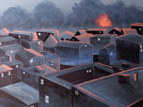
that was gloomy enough, but it could still be more gloomy than that. But with a lot of others, it's more like the colors are kind of tepid. They're not gloomy enough. So my paintings either need to be much darker, like the guy who painted those tree paintings where you just barely see the trees, it's night, or figures are just silhouettes.
The other side of that is using more intense color. I use lamps that are pretty bright so that I can see when painting small details. But that means the paint looks much brighter than it is in normal room light. And I end up with paintings that are limp in terms of color. I want to ramp up my color, make it richer and brighter.
So a couple of things I need to work on are continuing to explore tache as a painting technique and experimenting with more intense colors or much, much darker ones.
Tonalism June 18, 2022 13:21
I've been painting various landscapes as a break from doing still lifes using the Flemish technique, which got on my nerves. Trying to do fine details with worn-out brushes and essential tremor is difficult. I need to be able to rest my entire arm on the support or right near it. A mahl won't work. I decided that I would have to go without the Flemish technique and instead paint these things in watercolor with a wax finish.But I needed a break. My landscapes have never called for tons of detail, and I like painting them.
I did a couple using my long canvases (12 x 36"), which sold a print or two but are too large for me to get sales with at this point. I might turn the rest into NFTs when the market comes back up. It would be a good way to use up those canvases but still make some money from them and also get to keep the originals, which I like having around. So I will try that in a bit.
Meanwhile, because my small still life (9 x 12") sold right away, I decided to try some smaller landscapes, especially after I got totally frustrated with the mandrake still life. I have about 10 11 x 14" canvases that I forgot about, so I took one of those out. I intended to add the moon to whatever landscape I made, because me and my people love us a moon.
I started with a reference photo of some trees I've often photographed behind the apartment complex. I just like them as a group. I put those in against a background from another photo of a dawn in bands of gold, pink, and blue. I put the trees in with a combo of black spinel and prussian blue. I made only a few trunks and branches, and the rest was simply blotting a worn small brush around to make leaves. They came out well.
Next up, a moon, using my plastic circles thing. I knew I would touch it up again later.
Then, a group of crows flying towards the trees, and that helped me come up with a title, "Coming Home."
It was okay but to me the colors looked pretty loud after painting with a classical palette for the still lifes. And that's when I got the idea for Tonalism. I thought I might be able to create a Tonalist work simply by adding a glaze.
Some Tonalism is a little drab and depressing to me, but other Tonalist works feature the rich colors of sunset and landscapes made mysterious by darkness or mist. So I decided to try it.

So when the painting was dry, I oiled in and tried a glaze of transparent brown oxide. That made it look really dull. Too dull. I also tried making the moon brighter at that point, but it was too difficult not to mess the glaze up--nowhere to rest my shaky hand. And since the glaze wasn't really the right color anyhow, I wiped it off.
I tried again with transparent red iron oxide. That was a lot better but still too much on the dull side. So I wiped it off too.
I dug around in my red paints, of which I have a LOT. I needed something that was on the blue side of red to make the yellow more orange, the pink more pink, and the blue somewhat purple. But the quins were way too intense, the perylenes too dull, and I have a lot of scarlets.
At the bottom of the pile was a brand new tube of ultramarine pink. I opened it to see a purplish red on the dull side, and it's transparent. So I tried a glaze of that, using a very soft brush, my siccatif de courtrai, and some extra oil.
It worked. I might put another layer on when it gets dry to intensify the colors just a bit more. If I do, I will wait until that is dry and then finally lighten the moon.
I'm pretty happy with this painting so far. It really does look like a Tonalist painting, and it was quite easy and relaxing for me to do. I will make more such paintings, using different colored glazes to get different results. Really looking forward to exploring this farther.
A nifty discovery October 2, 2020 18:41
I recently tried some Light Dimensional Ground from QoR. I prepared two 12 x 12" canvases with it. I made one canvas very textured and the other much less so. The highly textured canvas was a problem when it came to finishing it with cold wax; the buffing tore off a couple of sharp points of texture. But I think the less textured canvas will be a success. There's only one bit that might be too sharp, and I will sand that down if necessary. Or just cut it off.
The texture, though, is gorgeous, IMO, so even though too much texture can be a problem in itself, I really want to find a way to work with it. Because look at this--> This is as good as texture I could get with impasto oil paint or acrylic, but no waiting several days for it to dry, no smells, and watercolor is easy cleanup.
It does act differently than paper. It's very prone to lifting, which I am trying to work with instead of resisting it. And so far I have not seen it run the way some pigments do on paper with misting. That's something I will try on the next painting to see what happens.
Because of the easy lifting, it can be difficult to glaze, but glazing with dry brush is a cinch. You can see that I've used it with the light metallic paint here. What's really nice is getting the pigment caught in all the creases--just magical! And it feels a lot like happy accident time like when doing wet in wet.
So I was all gung ho about this ground, having decided I could work around the excess texture issue, but there was also its price. A 4 oz jar is $11 + shipping and I used up 2/3s of it on those two small canvases. So I wrote to QoR and asked them if they were going to make larger sizes of the Light Dimensional Ground available.

They said that was especially marketed to watercolorists, but they had the same thing by another name: Golden's Light Molding Paste. And that comes in a 32 oz jar for $28. Heck, it comes in a bucket. Hell yeah!
I have plenty of supports lying around that I can apply this stuff to, ranging from 5 x 7" to 40 x 40" canvases and panels and boards. This stuff is so nice to spread with a palette knife too (finally I have a use for them other than mixing paint)--very sensual, like cake frosting. It is so nice not to have to worry about cutting paper to the right size to fit a standard frame and to produce works that can even hang as is, with not only no need for glazing but no need for a frame at all, if people want it (although I personally like a frame and feel like it does its job of protecting especially the corners of a support).
So I've got a ton of this stuff now and am really looking forward to learning to work with it.
Experimenting with different grounds September 17, 2020 14:48

I felt a bit stuck with that semi-landscape painting on watercolor ground on canvas. I couldn't get anywhere with it as a landscape and thought maybe it was because starting it as a landscape had been my entry into the box canyon. So I changed it up a lot, trying to push it into something abstract, but still felt like I was getting nowhere. And I thought it was just plain ugly. Bleh.
I think part of the reason was that I just didn't feel well. Had some kind of non-COVID thing for weeks. Plus I have thalassemia, a genetic blood disease, and its accompanying anemia can cause depression and anxiety. I sure was being hit with that. And I can't paint when I'm really down. Wish I could! Instead, I just get kind of paralyzed.

I started up a different painting on another canvas I'd prepared with watercolor ground, but I ended up being stuck in that one as well. So I chose to mess around with some Ampersand Clayboard that I forgot I had bought to experiment with egg tempera (which I once again had learned I do not have the patience for). I found them sitting in the bottom of one of my oil painting supply carts, so I took one out and painted way too many layers of watercolor on it. These are just little 6 x 6" panels, but I did learn that yep, they are totally usable for watercolor as long as you like lifting--that is, removing paint with a wet brush. I actually have been using that as a technique after being frustrated by it for years. I always preferred to glaze, which lifting interferes with, being kind of the anti-glaze. But then when I began using dark paint and white (often not allowed by traditionalists) in watercolor, I began to see how useful lifting can be. I still have a lot to learn along those lines. This is just an experimental mess. Up in the right-hand corner, you can see where I put on so much paint that I ended up with "bronzing," as it is called--a sort of sheen that some watercolor pigments take on when you use them too thick. OTOH, you could think of it as a feature instead of a bug if you had done it on purpose. But I hadn't. However, perhaps next time...

Then I went back to the second one I'd started to see if I could pull it out of the ditch. That was this. I had tentatively named it "Arrival of the Spirits." When I give a painting a title, that usually means that I see possibilities in it--that it might actually turn into a finished painting--although it's not infrequent that I give a work in progress a title only to abandon it and usually paint over it. I am thrifty about my supports. It's only when I can't manage to re-use a support that I just throw it out.
But this wip just kept sitting on my easel not doing anything because I couldn't figure out where to go with it. I like to use contrast in my paintings, and I had been working on that in this one. But there were so many things wrong with it. For one, I had tried to incorporate a blue iridescence that was too green. Etc.
So it sat.

I finally did get back to it yesterday and decided to try some drybrush on it. I first started using that when I was working mostly in casein. You dip the ends of your brush in the paint and then squeeze most of it out--in fact, it feels like you squeeze all of it out, but it turns out there is still a lot left. Then blot it on a towel. Then you kind of sweep the brush on the painting, back and forth like a cartoon house painter. It gets drier and drier but keeps on placing pigment for a long time, and even then, you can still kind of shape what's been laid down. I really like this technique. It's great for adding all sorts of shadowy depth or layers of color to a section but also good for making glow. I mixed a primary yellow with some titanium and ended up with this.
I think it's moving toward something I will finish now. Still needs more contrast and some shaping of the light parts, but it's getting there.
Rose Moon and Vibrating Color June 3, 2017 08:18 1 Comment
 In Spirit of Rose Moon, I let myself play with color a lot more. I worked hard with many layers of glazing to get a good gradation in the sky area of pale yellow to pink to blue. My efforts paid off, I think. Read more...
__________________________________________________