My Blog
The Road to Mixed Media June 9, 2024 20:10 2 Comments
 About six months ago I decided to go ahead and experiment with using watercolors to make abstract paintings. I knew that they were not traditionally used for abstraction, but it was precisely that fact that attracted me. Watercolors didn't have the baggage that oil painting has (for me) with respect to abstraction. I did a couple of paintings back in December 2023 I was very pleased with (<--this "Lanterns of Hekate", and this --> "Roots").

I really liked how these came out. But it bothered me that they were both monochrome. I've always had problems with color use. I addressed this by using limited palettes. Some were even classical palettes, such as some listed by Tad Spurgeon's fabulous book, "The Living Craft" (which I highly recommend for painters, especially oil painters). A limited palette really helped me, and I researched which pigments were recommended for blending with other pigments, leading to many happy years of paint nerdiness--and better color composition in my paintings. I got to really enjoy, for instance, using "vibrating" colors, even just relying on pairs like blue and yellow (my favorite) to add interest to my paintings without getting lost in a candy box of all colors everywhere.
But the truth was I really liked monochrome, especially black and white. I just wondered if other people liked such paintings. Wouldn't they be considered drab or even deepressing?
Well, not everyone considered them drab or depressing. A customer bought both of these paintings less than a month after I completed them. That encouraged me to go a bit farther with monochrome paintings.

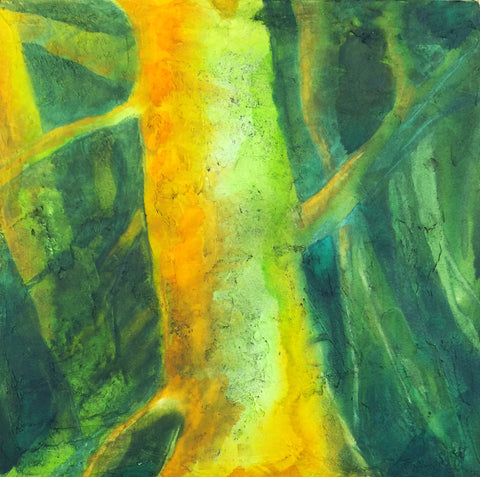
That same month I began a much larger painting than usual that I worked on for a couple of weeks. I had in the past flirted with using automatism in my painting, but this time I went whole hog, using it over the entire painting instead of in patches here and there. I started with some Daniel Smith's Lunar Black, a highly granulating paint, and just slapped it on the paper, not trying to paint anything in particular.
When the paint dried, I began picking out a subject I had only very rarely painted--an interior. I was surprised at how much I enjoyed doing that. I also brought forward a large number of small weird shapes and figures in the paint and ended up with a mostly monochrome painting with a rather dark and spooky atmosphere. The only color I added was yellow, and that was in the form of colored pencil, since I couldn't glaze over the granulated black paint without destroying the granulation. This was the first time I combined colored pencil and watercolor, and although it worked well, I felt a bit weird about it. Would I be looked down upon for this combo? Did using it mean I wasn't a "serious" artist?
I was very happy with the result, but once again I wasn't sure what people would think of it. I got plenty of positive comments on it, but no one purchased it. So I held back on the monochrome stuff.
Then something happened to me. A big part was attending an active shooter training session at my synagogue in February. My synagogue, another right over the border in MA, and the JCC in Providence all experienced bomb threats in which the caller (no, not an immigrant) informed us that since WE were killing Palestinian children, he was going to kill OUR children. They caught this guy, but he wasn't the only one. And he was far from being the only big-mouth Jew-hater in the world, and right here, where I lived.
Something in me changed forever on October 7, and that combined with the various reactions around me, of people I'd considered friends for years, and then the bomb threats and the training session (of which we will have more), made me determine that I had to find a way to deal with the darkness that was pressing in all around me and that was pulling me into despair and fury. I thought maybe monochrome, especially black and white, would be a good way to handle this emotional darkness. Let the poison out, as Fernando Botero said about his 80 paintings of men being tortured at Abu Ghraib by American forces in Iraq.

So I decided to try going with monochrome and see how it panned out. The next painting came a week after the active shooter training session. I called it "Garden Fairy," although it is the complete opposite of the usual New Age bland Tinkerbell. I have never put it up on my site, although maybe I will do it now that I feel much warmer towards it. It functioned as a kind of gate to freer painting. This began with a plan to paint an old woman in a huge sunbonnet, but rage took over as I slapped mars black paint on the paper. The image arose like a demon in a sorcerer's triangle.
I knew right away that this painting was important for me as an artist. It was ugly, but in a powerful way. It represented my own rage at the circumstances me and my people were being subjected to, but it also stood for my protective spirit. I was glad it did not incorporate any political imagery whatsoever--because I have never wanted to be a "political" artist. That is not my gig, even though I enjoy much political art. This painting was definitely monochrome, but it was also an expression of my own raw feelings, which I had basically never incorporated into my art.
I have never been an emotional painter. I have used my art to create places I would feel good about escaping into. When I got depressed, I could not paint.
So this painting of rage was seismic to my art. It united my interest in monochrome and my exploration of Surrealist automatism into an instrument of my emotions. Since then, I have continued to work in this direction and to tap into my subconscious for imagery--to allow the darkness to pour out. IMO, the paintings I have made since this one are some of the best I have ever created. I look forward to creating many more scenes of a dark world--dark, but not without hope.
Light Dimensional Ground on Canvas September 19, 2020 12:34

I got some of QoR's Light Dimensional Ground and applied it to a couple of 12 x 12" canvases I had sitting around. The stuff was easy to spread with a big palette knife, but I used up 2/3s of the little jar on two canvases. I don't know if I just used too much or what. I like oil paintings with a lot of texture, and I thought I might be able to capture that effect with this stuff, so I went to town. You can see the amount of texture I ended up with.
This stuff is not as smelly as the regular watercolor ground, but I still let it dry out in the hall during the day, and since we have hooligans coming into our building at night to fuck around, I took the canvases in and put them in my window to complete drying overnight. As long as it doesn't rain or freeze, I think that's going to be a good place to let stuff dry.

Today I could hardly wait to try out these supports. One technique I use a lot in watercolor is apply some paint and then mist with a hair mister to get it to run and to encourage particles of pigment to settle in the texture of the paper. I find a hair mister works many times better than a regular sprayer. You can do tiny puffs of mist just where you want them or quickly mist the whole thing to encourage granulation. I was hoping that I could do that with this ground, but I wasn't sure, since I kept reading about how it was spongy. A spongy surface might just sop up the pigment and not allow it to run. In fact, at least one review said that.
But that's not what happened with my paint. I used Daniel Smith's Green Apatite, Winsor Newtown's Prussian Blue, Daniel Smith's New Gamboge, and Winsor Orange. The apatite settled out a dark purplish brown color different from the green that dominates it. It fell into a lot of the creases and rumples and showed up as wonderful specks. It doesn't photograph well, but the photo above shows a detail.
Here's the whole painting. When you get close to the support, it does have the look of grainy paper, but the texture reminds me of acrylic, like modeling paste. The paint isn't shiny in any way. It's completely matte. I didn't feel much of a difference between this and painting on CP except that it lifts much more easily. I tried using that to my advantage to create limbs and trees in the background, but they ended up being overworked. I also tried some highlights that way, but it looked like too-vigorous lifting. So I think I might try lifting and then painting another color over the lift area, like zinc.
I'm not sure if I will add more to this. It might look better with some blue added, especially my beloved cobalt, but OTOH, I'm eager to go ahead and seal it with cold wax and see what happens. I asked the manufacturer if they thought it would be okay to use cold wax on this, because of the spongy thing. They said they didn't know but sounded kind of doubtful. That might be because no one has tried it yet.
This stuff has a lot of possibilities, but I am not sure how much I am going to use it because it is pretty expensive in terms of how far it goes. They produce it only in a small 4 oz jar. :( However, it might be possible to use Golden's molding paste and then either use watercolor on it or spread some of the regular watercolor ground over it.
However, I did just order some of Golden's Crackle Paste to try for texture as well. I didn't realize it could be used with watercolor, but on a hunch, I thought if light dimensional ground could be used that way, so might crackle paste. I can hardly wait to get my hands on it.
I am sensitive to acrylic, but I did okay with these grounds and I don't anticipate hovering over the stuff like I used to do with my paints. I will also allow the supports to dry out in the hall and/or in the window, so I think I will be okay.
I know some people might say, "Why are you trying to get texture with watercolor?" I know it's not "traditional," although in the 19th century, British watercolorists used aquapasto in their watercolors, which can produce low dimensionality with watercolors and is made from gum arabic and silica gel (that is treated in a way that makes it safe). I've used that in the past. It can give you brushstrokes similar to a not-too-heavy Impressionist style. I still need to play with that more.
But as for why insert texture into a watercolor painting, why not? There is no reason why oils and acrylics should get to have all the fun. Texture really expands watercolor and doesn't change its fundamental nature.
Lots of possibilities!